The History of the Jakeman’s Maple Products Logo
Posted by JAKEMAN'S MAPLE PRODUCTS

The Jakeman’s Family has had a long history of Maple Syrup production from the simple beginning as mixed farmers, taking care of cows, chickens, pigs and maple syrup, to the specialization of syrup only production. The history goes back over 140 years with 5 generations of farm families taking on the task to learn from the previous generation and perfect maple syrup to our finest blend.
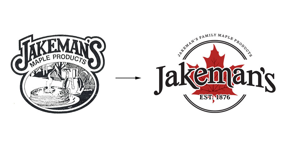
The Jakeman’s logo really took centre stage on our labelling by 1985 with the introduction of the curved Jakeman’s text and the pancake illustration. The use of the strong text element for the Jakeman’s name and the historic imagery is a proud recognition of our heritage from 1876.
By 1987 our very own Bob Jakeman became president of OMSPA and innovations were needed. With the growth of the gift market and tourism, Jakeman’s worked with local artist Bill Paquette to create the initial Jakeman’s red leaf logo.

The red leaf logo stayed strong through iterations in the 90’s, and 2000’s. In 2004 Jakeman’s won the National Posts blind taste test and was voted “Canada’s Best Tasting Maple Syrup”. To honour this award a specialty gold medallion logo was released.
By 2010 the Jakeman’s logo took on our tried and true shape which included a red maple leaf, Jakeman’s in text across the centre with black edging, and a swoosh banner which includes “Since 1876” across it.
At the beginning of 2020 we rolled out our new logo representing the generations of Jakeman’s family with the red leaf centre stage. Even though the world may currently be in turmoil we can always rely on family and the history of Jakeman’s to make sure we always have the best Maple Products available for you and your family.
Check out the full list of logo progressions from 1985 to current below and don’t forget to order your maple syrup from our online store year-round.


